Operations4 min read
Most of your visitors are standing up
Mobile-first is not a design fashion. It describes the actual conditions your site is used in — small screen, one hand, poor signal, in a hurry.
Published
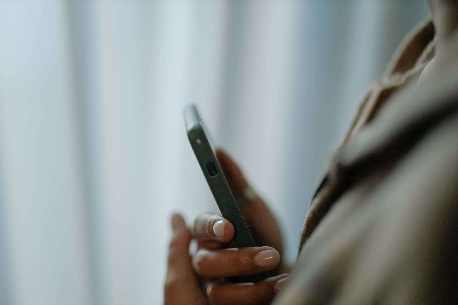
For most local businesses, the majority of visits come from a phone. Not from someone sitting at a desk with time — from someone on a pavement, one-handed, deciding whether to walk in.
“Mobile-first” is just taking that seriously. It is not a style. It is designing for the conditions the site is actually used in.
What those conditions are
- A screen roughly the size of a postcard.
- One thumb, reaching about two thirds of it comfortably.
- A connection that may be one bar in a basement.
- Roughly ten seconds of patience, often less.
What that changes
The phone number should be tappable, not typed. The address should open a map, not sit as text to copy. The thing you most want people to do should be reachable without pinching, zooming or hunting.
It also changes what gets cut. A carousel nobody swipes, a hero video that eats the data allowance, a menu that needs two hands — these are not neutral on a phone, they are obstacles.
Design for the pavement, not the desk.
The test costs nothing. Open your own site on your own phone, on mobile data, standing up, and try to do the thing a customer would want to do.